
June 30, 2011
Tech Company Organizational Charts
Clever satirical commentary by Emmanuel Cornet on several large tech companies expressed as organisational charts.
Tweets During the Japanese Earthquake
Twitter has just published a couple of videos that visualize the flow of tweets before and after the March 2011 earthquake.
The first video shows @reply tweets in the hour preceding and following the earthquake, to (pink) and from (yellow) Japanese Twitter accounts. You can clearly see the sudden jump in the volume of tweets following the earthquake.
The second video shows tweets originating in Japan (red) and then being retweeted (green) around the globe in the hour following the earthquake.
Twitter reports that the volume of tweets spiked to 5000 tweets per second five times in the hours following the earthquake and tsunami. A vivid example of Twitter's reach as a global communications tool.
June 22, 2011
Open Source Scientific Visualization (vs. Information Visualization)
A colleague recently sent me a link to ParaView, an open source scientific visualization tool. In my day job I usually work with information visualization techniques but that wasn't always the case; my visualization career began with scientific visualization (a post-doc working with 3D confocal microscope data).
So what's the difference between scientific and information visualization? According to Wikipedia, scientific visualization is:
... primarily concerned with the visualization of three-dimensional phenomena (architectural, meteorological, medical, biological, etc.), where the emphasis is on realistic renderings of volumes, surfaces, illumination sources, and so forth, perhaps with a dynamic (time) component
and information visualization is:
... the visual representation of large-scale collections of non-numerical information, such as files and lines of code in software systems, library and bibliographic databases, networks of relations on the internet, and so forth
A couple of examples are shown at the end of this post.
Personally, I think the main difference is the domains from which the data to be visualized is drawn. Scientific visualization tends to deal with data from the physical sciences; astronomy, meteorology, physics, engineering, geology, biomedicne etc. whereas information visualization works with data sets from different (non-physical) science domains and non-scientific domains. As a result the nature of the data and the questions being asked also differ and lend themselves to different visualization techniques. So, for example, scientific visualization makes use of volume rendering and vector field diagrams, which provide a direct view of physical data, whereas information visualization uses parallel coordinates and network diagrams which are abstract representations of non-physical data. These are generalisations of course; information visualizations can be applied to physical data and scientific visualizations can be used with non-physical data, but as a general rule the difference is the data domains.
So, returning to ParaView, upon seeing it I wondered what other FOSS scientific visualization tools were available these days. Here's what I found:
- ParaView: built atop of the venerable VTK visualization toolkit
- VisIT: developed by the Department of Energy to visualize the results of terascale simulations
- OpenDX: IBM open-sourced their Data Explorer product
If you know of any others then please let me know.


June 14, 2011
Infographic Introspection
Infographics cop a lot of flak from the data visualization community for such things as their superficiality and contravention of good design principles.
Several designers have taken such criticism on board and responded to it in the only way they know how ... as infographics about infographics.
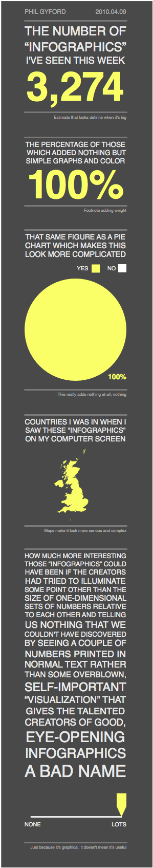
Phyl Gyford got the ball rolling with the infographic shown below:
Think Brilliant's Dave Fields, then broke every rule in the book with his Intimate Look at Infographics:

Then Tanner Ringerud donned his tinfoil hat and spilled the dirt on The Truth About Infographics with an Infographic Backlash Infographic. Apparently, the plethora of infographics flooding the Internet were all part of a grand conspiracy to game Digg!

E Factor Media decided to take the matter a more seriously with their Infographic.

Susannah Bandish explored the numbers behind 2010: the Year of the Infographic.

And most recently, Ivan Cash tried to cram every trick in the infographic playbook into his Infographic of Infographics.

If you come across any other infographics on infographics then please point them out to me.
Several designers have taken such criticism on board and responded to it in the only way they know how ... as infographics about infographics.
Phyl Gyford got the ball rolling with the infographic shown below:
Think Brilliant's Dave Fields, then broke every rule in the book with his Intimate Look at Infographics:
Then Tanner Ringerud donned his tinfoil hat and spilled the dirt on The Truth About Infographics with an Infographic Backlash Infographic. Apparently, the plethora of infographics flooding the Internet were all part of a grand conspiracy to game Digg!
E Factor Media decided to take the matter a more seriously with their Infographic.
Susannah Bandish explored the numbers behind 2010: the Year of the Infographic.
And most recently, Ivan Cash tried to cram every trick in the infographic playbook into his Infographic of Infographics.
If you come across any other infographics on infographics then please point them out to me.
June 10, 2011
Pervasive Visualization
Today I came across an interesting blog post listing 21 Everyday Visualizations. As the title suggests the article lists 21 objects we encounter in everyday life that graphically encode information. The article reminded me that visualization is pervasive; it's not confined to the digital realm.
The objects identified include calendars, weather maps, traffic lights and scales. The objects represent a fairly small set of visualization primitives:
For the full list visit the Epic. Graph blog. If you can think of any other commonplace visualizations then please suggest them to Mark (the Epic. Graph blogger). I've suggested the financial indicators used in business news (TV, print, web) to indicate daily movements in stocks, indices, exchange rates, commodity prices etc.

The objects identified include calendars, weather maps, traffic lights and scales. The objects represent a fairly small set of visualization primitives:
- maps
- icons
- gauges
- dials
- histograms
- pie charts
For the full list visit the Epic. Graph blog. If you can think of any other commonplace visualizations then please suggest them to Mark (the Epic. Graph blogger). I've suggested the financial indicators used in business news (TV, print, web) to indicate daily movements in stocks, indices, exchange rates, commodity prices etc.
Subscribe to:
Posts (Atom)