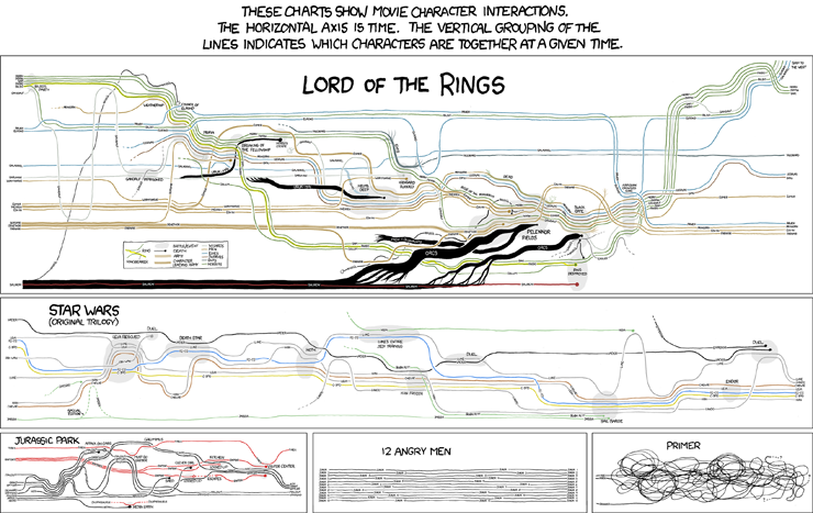
Movie Narrative Charts
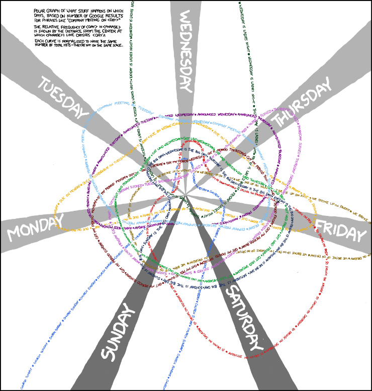
Days of the Week
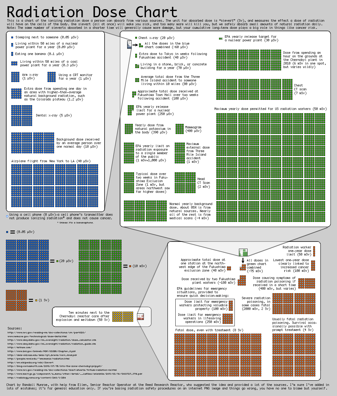
Radiation Dose Chart
I've blogged about this one previously. Following the Japanese earthquake and tsunami in March 2011, Monroe published the following chart to provide some perspective on radiation doses.
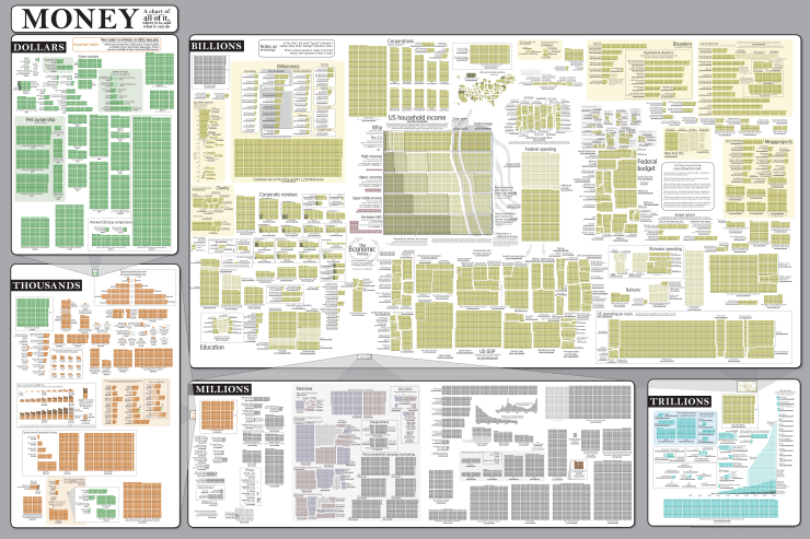
Money
And in a similar vein is this epic graphic...
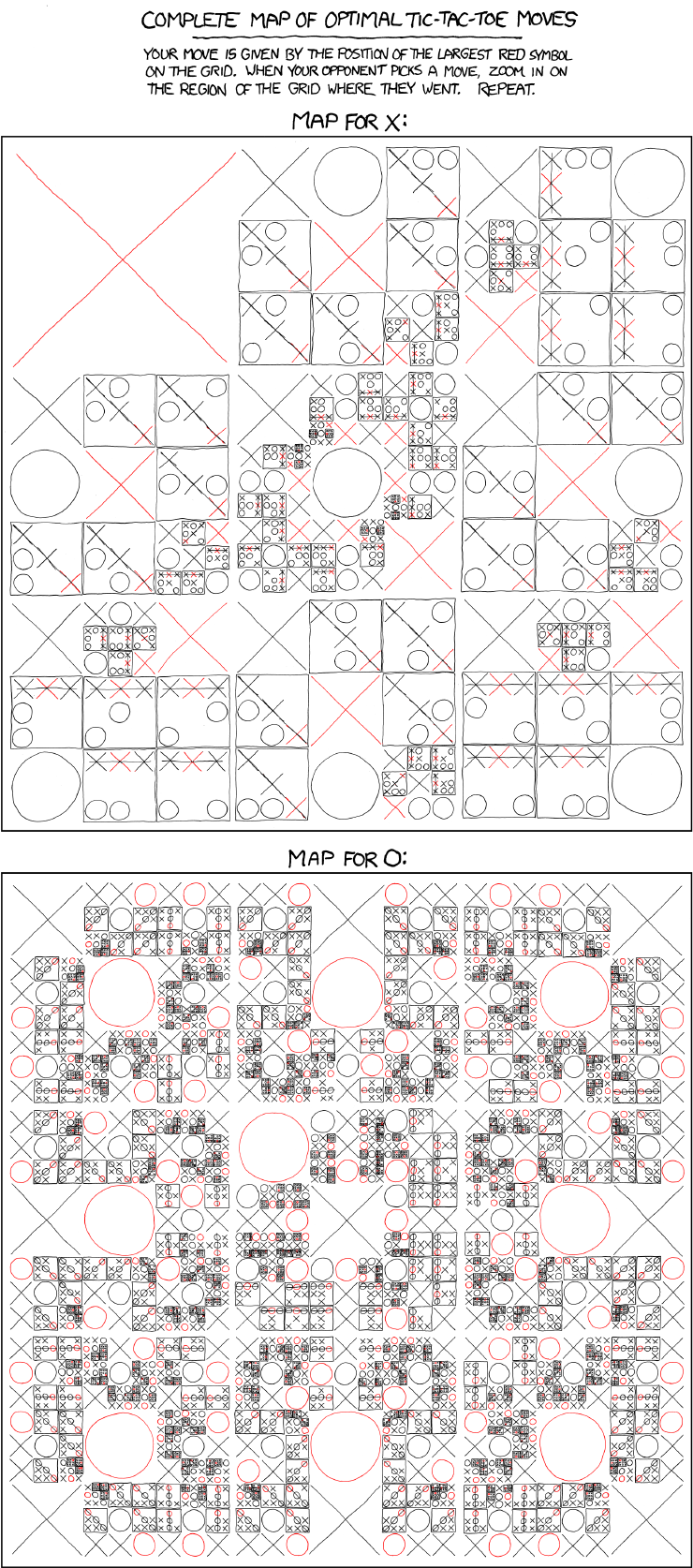
Tic-Tac-Toe
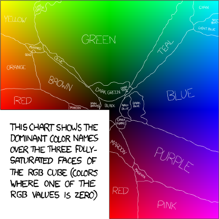
Colour
Randall conducted a survey of 222,550 users (sessions) for the names they ascribed to over five million colours. From a subset of the results he built the map below showing the most popular names for the fully-saturated colours.
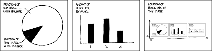
Self-Description
Three clever self-referential charts.
Some rare examples of good infographics:
Height
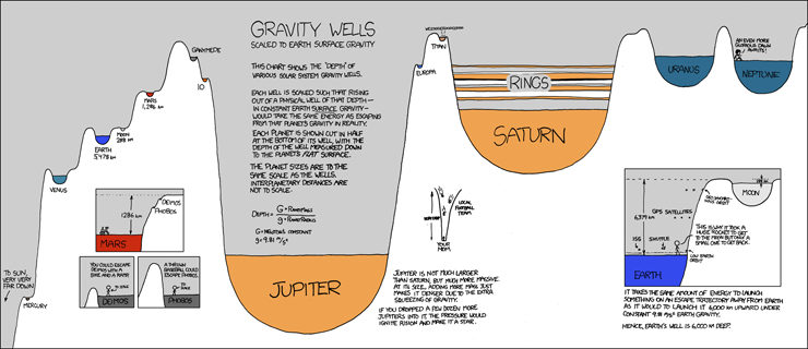
Gravity Wells
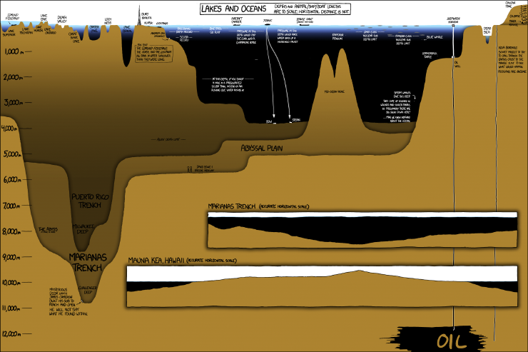
Lakes and Oceans
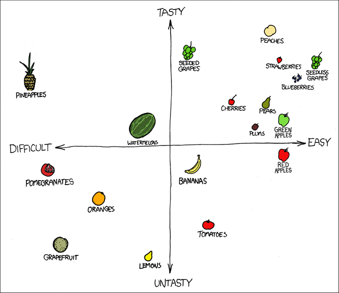
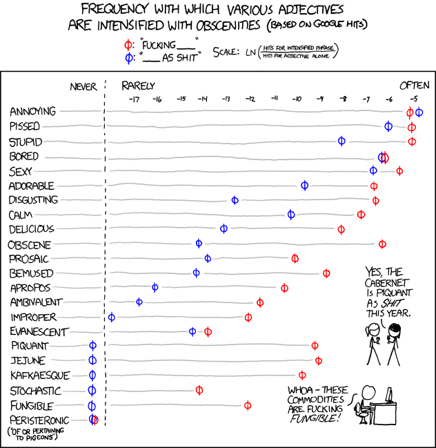
Fuck Grapefruit
The outlier that is grapefruit.
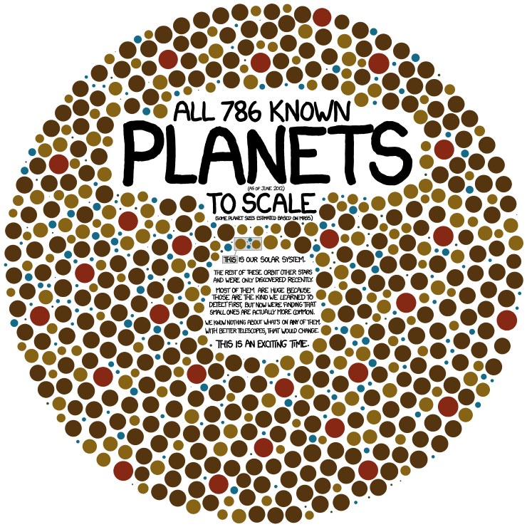
Exoplanets
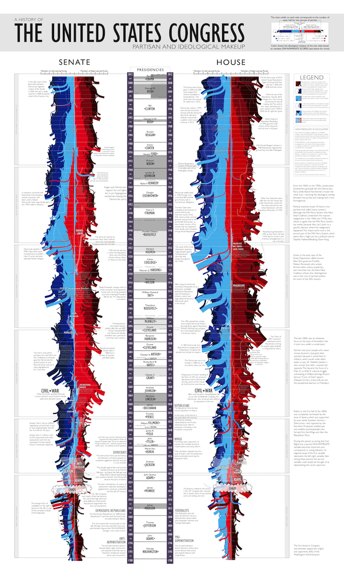
Congress
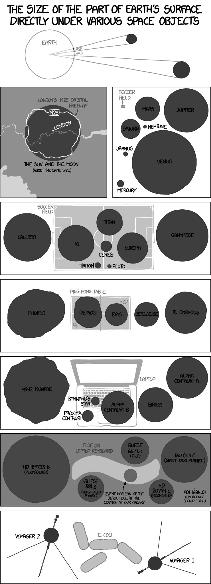
Angular Size
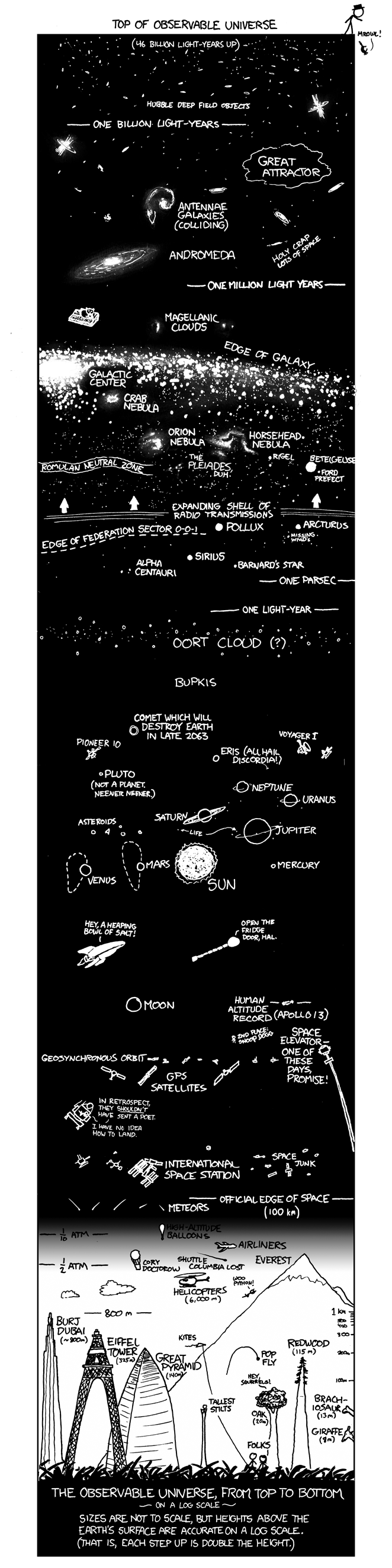
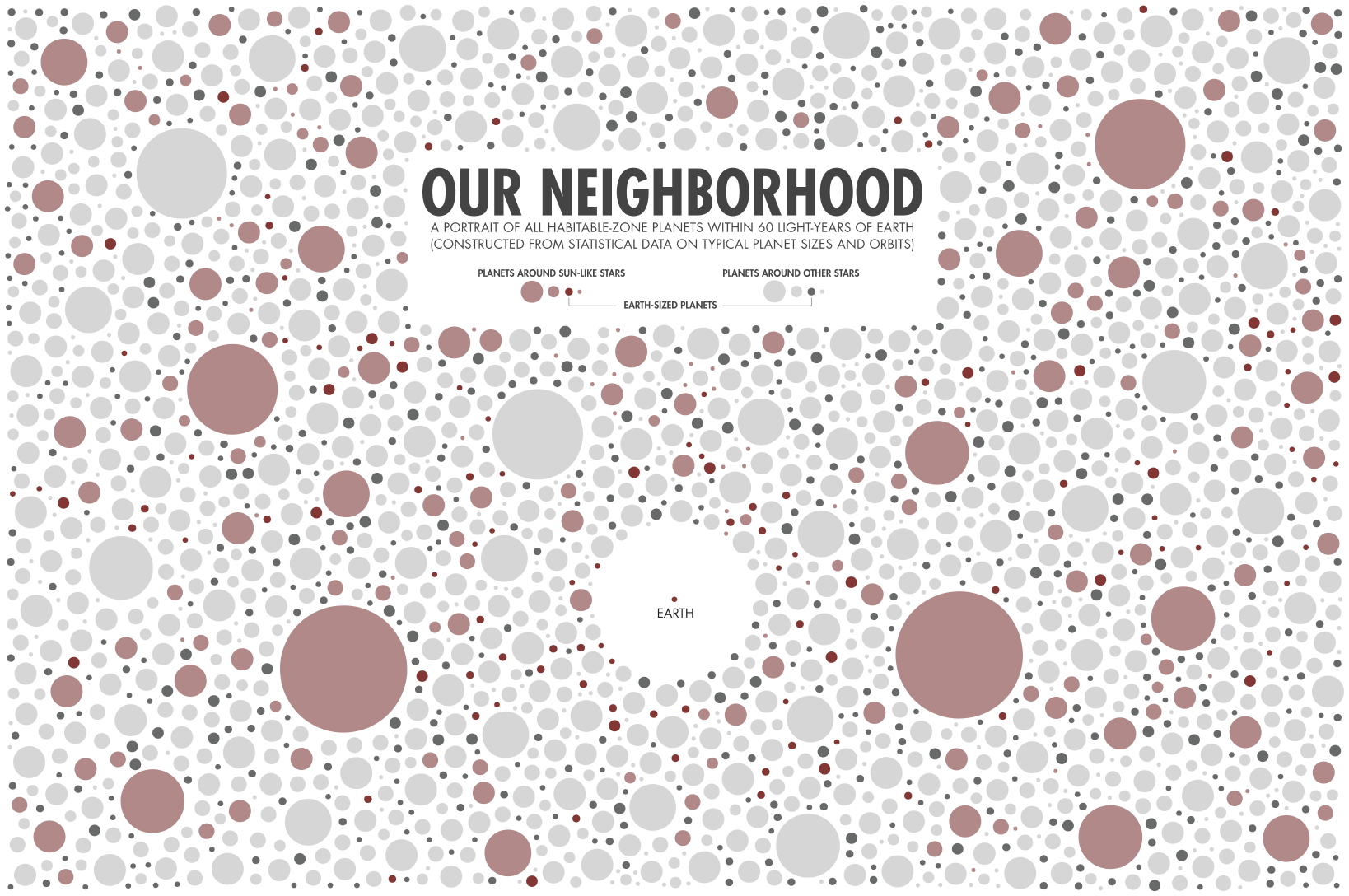
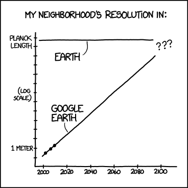
Our Neighbourhood
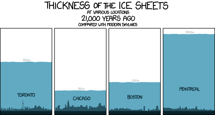
Tall Infographics
The remaining examples I've simply grouped by type.
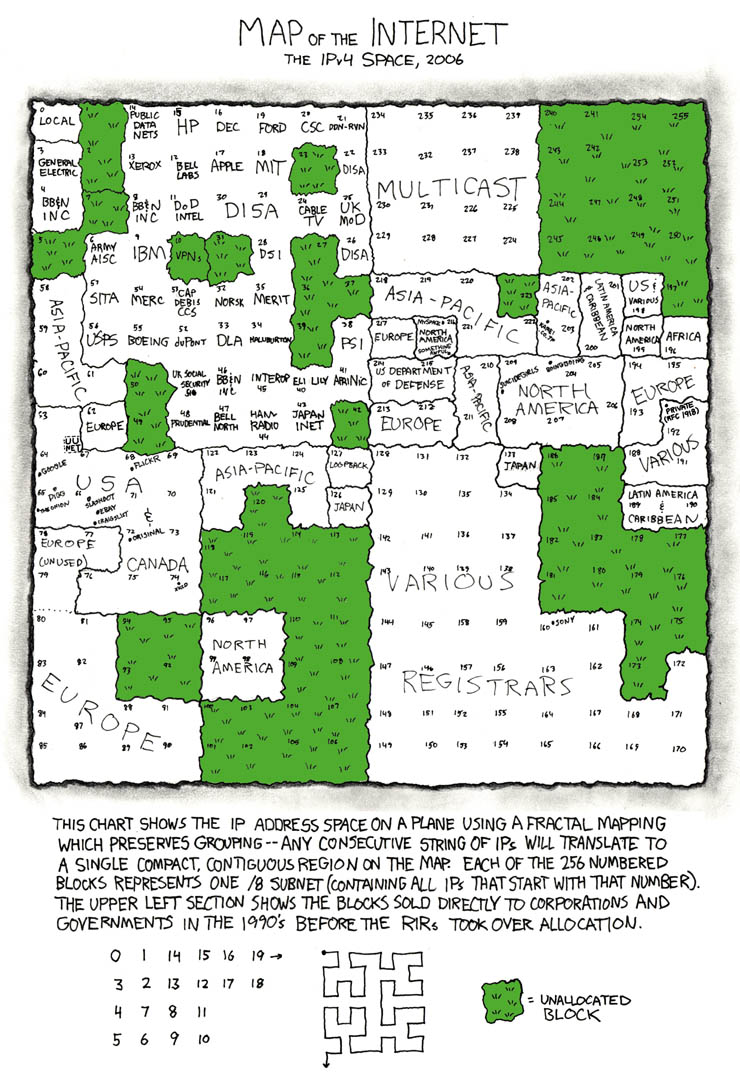
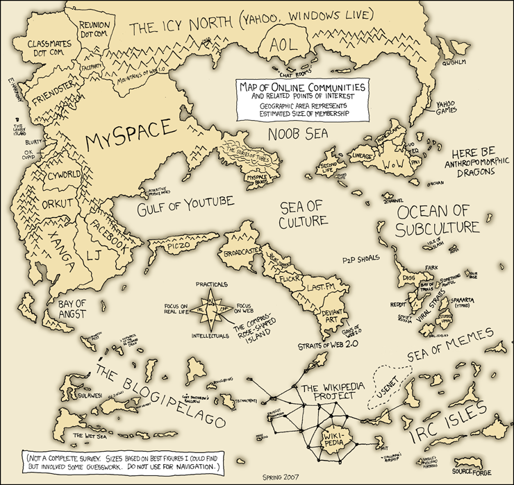
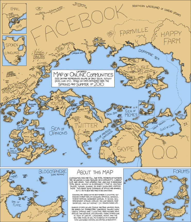
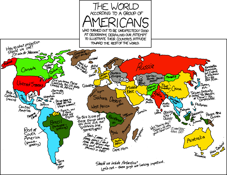
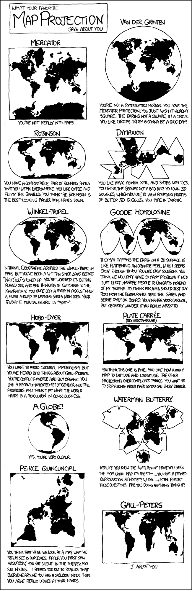
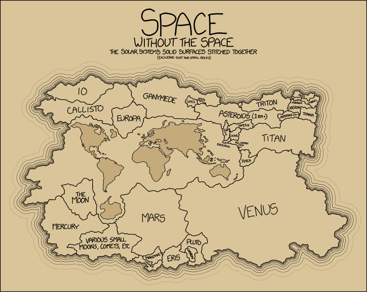
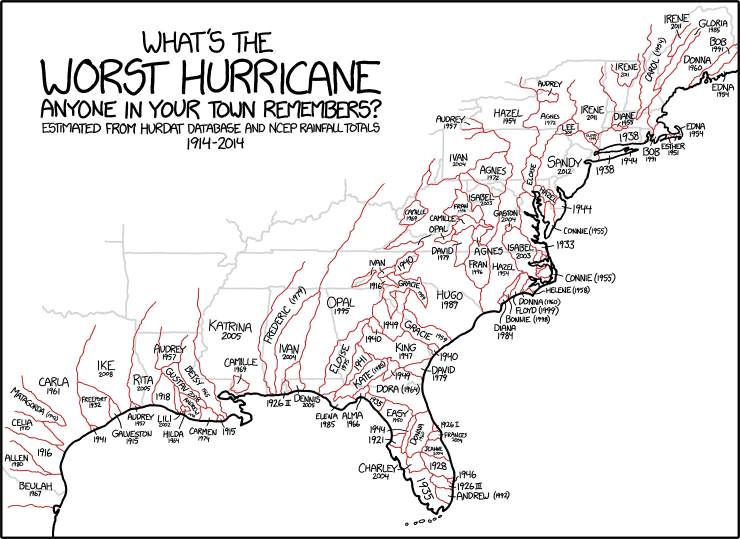
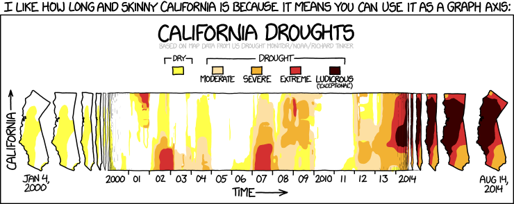
Maps

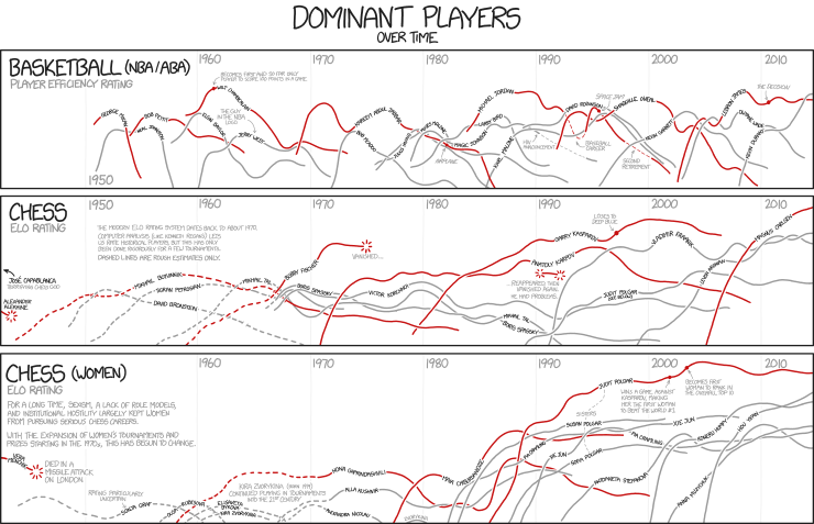
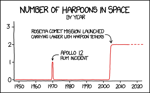
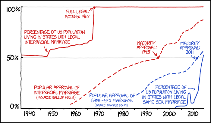
Line Charts

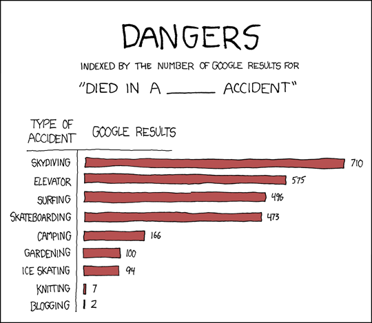
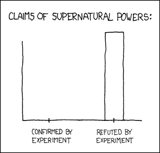
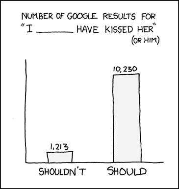
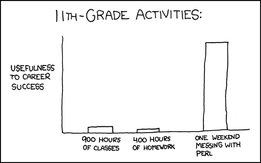
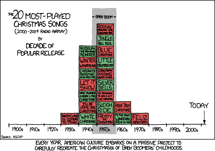
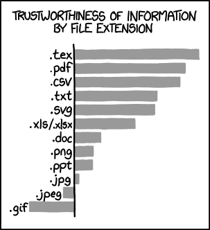
Bar Charts
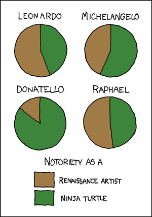
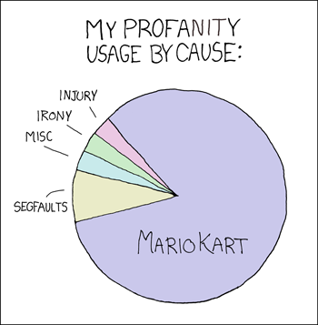
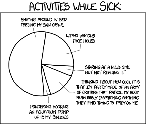
Pie Charts
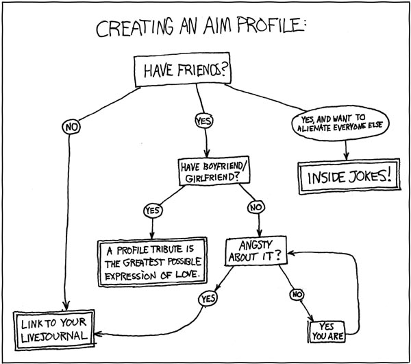
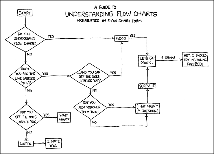
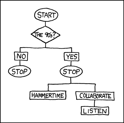
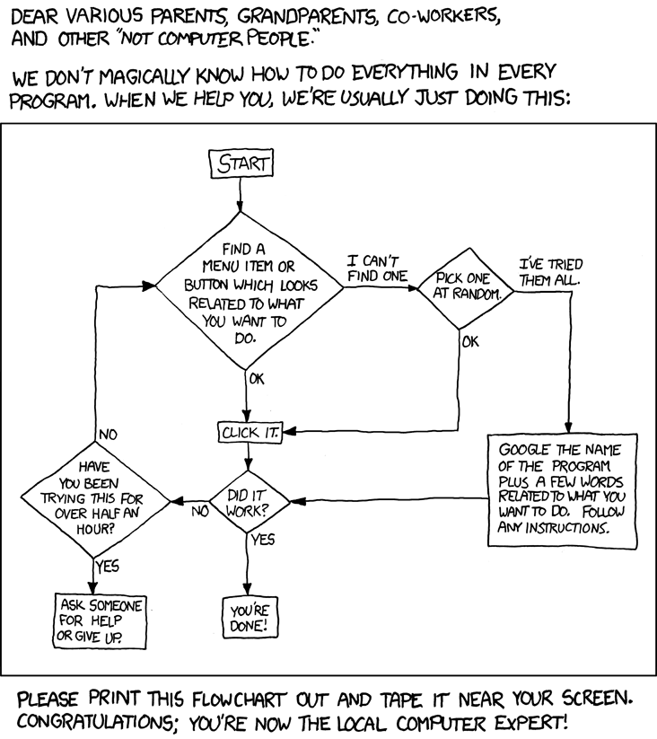
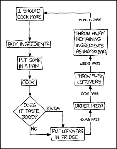
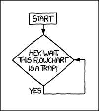
Flow Charts

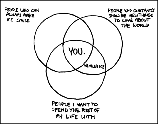
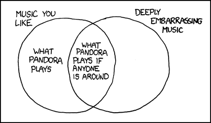
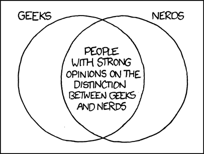
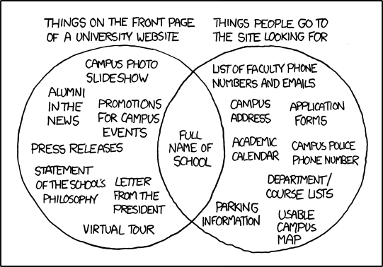
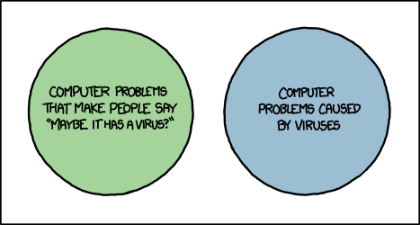
Venn Diagrams
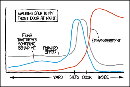
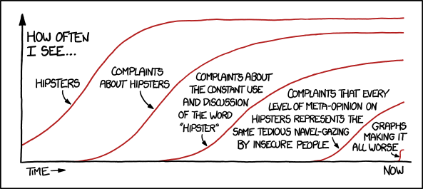
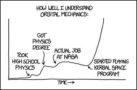
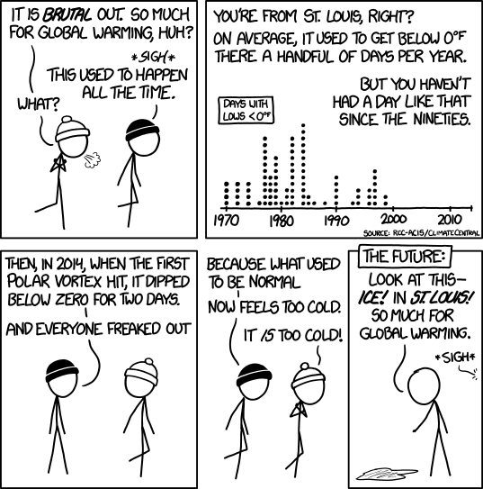
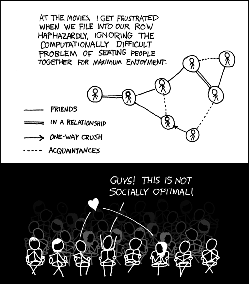
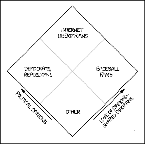
Miscellaneous
Please leave a comment if I've missed any.