Sheehan mapped the relative abundance of elements in the earth's crust to the area assigned to each element in the table. As Sheehan said: The chart emphasises that in real life a chemist will probably meet, O, Si, Al, ... and that he better do something about it.
More recently, the Big Picture team at Google Research produced an interactive version of Sheehan's cartogram. In the Google version you can choose between several choices of mapping variable:
- mentions in books
- abundance in the human body
- abundance in the earth's crust
- abundance in the sea
- abundance in the sun
- volume
- volume (excluding gases)

Additionally, you can choose to represent the mapping variable in several ways:
- bars
- cubes (as shown above)
- electron rings (not a mapping variable; shown below)
 The on-line version is interactive so you can experiment with the settings. Mouse-over an element in the table to display a tool-tip with additional information about the element.
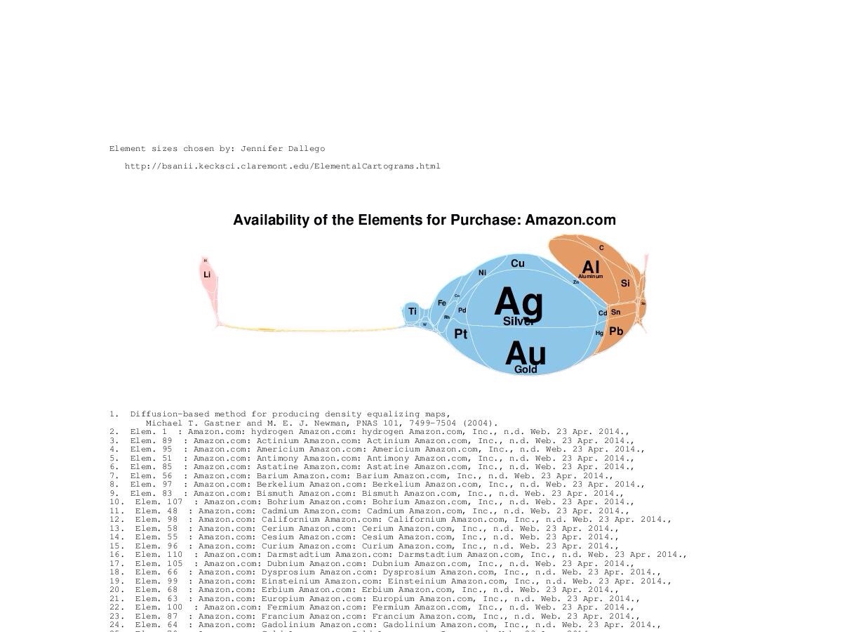
Along similar lines is the Elemental Cartograms tool developed by Babak Sanii, that allows you to specify your own table of elemental data, and will generate a cartogram accordingly. Below, for example, is the availability of elements for purchase on Amazon. You can find many more weird and wonderful examples on the Elemental Cartograms Tumblr feed.